Help > Graphics Critique & Questions > Post Reply
why am I just not connecting?
Subʷᵃʸʐ -> This is the end. July 23rd, 2018 9:16:08pm 651 Posts |
Ugh.
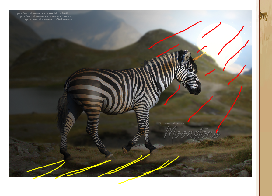
got the credits and stuff down- I'd love some feed back though
I am really trying to work with shadows (on the zebra) and stuff lately
but for some reason this one and I just aren't working
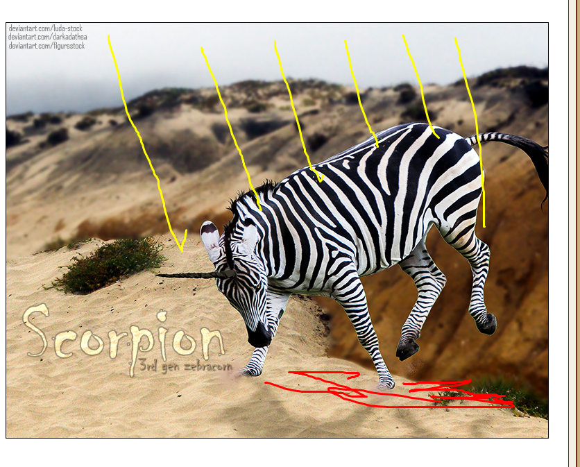
I'd also love some imput on scorpions piece as well, because I am alternating between really liking it, and really hating it.
The shadow position is wrong I know, but I already flattened the piece and can't fix it.
|


View Comments 1
 Maharet : Taking a break : BV & Blitz watching July 27th, 2018 7:00:40pm 2,469 Posts |
bumping for you 

 |
siib 🦈 [ Gone ] August 1st, 2018 6:57:53pm 2,627 Posts |
I love both of these!
Sorry, no graphics comments from me since I don't do graphics anymore and I sucked horribly to begin with. ;) |
 shee ‡ the lavish lhasas August 3rd, 2018 6:04:22am 173 Posts |
I agree with you on the shadowing on both images, it looks a little off. I suppose my advice would be that unless your lighting is super harsh, you don't need to have the shadow be an exact silhouette of the horse/dog. It can be blurred out quite a bit. For Moonstone's picture, I can't 100% tell if the orb of light is coming from his horn or if it's peaking from behind the mountain. If it's an orb from his horn, his front half would be brighter and you probably wouldn't have the shadow outline of his head. If it's from the mountain, you're good! Maybe just angle the shadow backwards a tad? I'm only giving feedback because you asked, haha, but I think both pictures look great! I really love Moonstone's, my favorite part is the face. The horn, the light, his forelock and eye all go together super well. It looks awesome! :D Scorpion's picture is great too, I like the action shot and the blurred background really makes it pop. You did a really good job cutting both of those zebras out too!  |
Conduct September 17th, 2018 9:36:27am 10 Posts |
I love the 1st!!! |
primrose •• truth, dare, spin bottles ♥ September 17th, 2018 9:55:06am 2,687 Posts |
these are wonderful.
my only comment on shadowing is keep in mind how the lighting would look in an actual photo.
1st one. Shadow would come more at an angle instead of direct next to the zebra. as the light source is in the top right corner. and not coming from the center back.
2nd one: light source is neutral in the background and more coming from above so shadow should be beneath the zebra more than the side. as the light source isnt coming from the center back.
**i used lightshot to show what i mean :) |
View Comments 1