Help > Graphics Critique & Questions > Post Reply
The two styles
Subʷᵃʸʐ -> This is the end. November 16th, 2018 4:08:38am 651 Posts |
While I am unable to really work on my graphics right now - I am always looking for ways to make them better in the future.
It seems as if there are two main type/styles of horse graphics ...
I find that detailed sytlized takes a bit more time .. (And for some reason smudging and I have never gotten along. It is something I have battled with fore some time, and am constantly trying to make look right) ex :
but the more naturalistic is harder to make look as purposfully professional (I put that wrong, the wording is illuding me right now :P) harder to get right, but when you do it looks really right ex:
(Obviously this is a zebracorn so there is an element of stylization - but hopefully someone gets what i mean xD)
(There are probably not t he best examples, but they are what i ha ve off hand ) Moving foreward, I am curious to which people prefer more.
|
View Comments 1
 mero;: } bye felicia 👋 November 16th, 2018 3:59:47pm 4,681 Posts |
I definitely prefer doing more naturalistic pieces with extra precise cutouts, very well-blended or matching subjects/backgrounds, minimal coat smudging and very realistic mane/tail. It can be harder to pull off than super-stylized but I find the whole idea of a graphic looking like it was an actual photo taken out in the field with just some text added super-appealing! :) Of course stylized graphics are delightful as well and I love seeing the creativity a lot of people use - I'm just more fond of the "the animal is actually IN this photo" look. (especially if there's a surprise factor of an unexpected background, like the graphic I made for Con of a GSD in a library, or a corgi in a dessert case!) If I do fantasy-esque images they tend to be more realistically rendered than super-stylized - |
 shee ‡ the lavish lhasas November 18th, 2018 1:14:53am 173 Posts |
I do find fantasy-like manipulations gorgeous if they are done well. I've always preferred naturalistic manipulations, so that's what I do with my own graphics. I rarely offer custom graphics (I think I've opened my graphics like 2 or 3 times in my 8 years on HP lol), but I do premades quite frequently and I've always felt like realistic images sell better in the auction. I love being able to get an idea going in my head and work on a graphic without time constraints or any restrictions on style and just do my own thing. That being said, I spend a lot of time on my graphics and I obviously want to be paid for that time. That's why I stick to a natural style with horses that could pass as multiple different breeds.  |
mango 🍑 kinda gone? November 19th, 2018 9:45:10am 2,927 Posts |
I personally prefer more naturalistic to stylized, but I also like just a touch of stylization. Mero's hyperrealistic "this is actually a photo not a manip" style is super impressive, but idk I feel like my manips need to have a hint of stylization (like her fantasy manips! I'm still so in love with Traveler's image!). I like the manip to actually be recognized as a manip? If that makes sense? It took me a while to get there, with my own graphics. I started out going very stylized, with special blurring effects and a "painted" feeling, which was pretty popular at the time: I took a lot of inspiration from Eluh and Trig's graphics (especially Trig's: ex. https://horsephenomena.com/horses.php?id=274470). But the styles I used just didn't really speak to me until I tried out a very realistic style (it is to this day my favorite manip): It's hyperrealistic, with super sharpened lines and minute details. But it also has a hint of drama that's not particularly realistic. The drama mostly comes from the lighting and colors though, so it may not really count as stylization?? Idk, that's up to you to decide lol. More examples of my style:  |
primrose •• truth, dare, spin bottles ♥ November 19th, 2018 11:34:52am 2,687 Posts |
I prefer natural vs styleized for my own ponz but i like both while creating art. For me it depends on how creative im feeling or what the person ordering would like.. The only time id personally order a super fantasy type or stylized is if im doing a project animal and want an image to POP :)
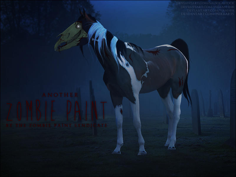
My zombie paint image
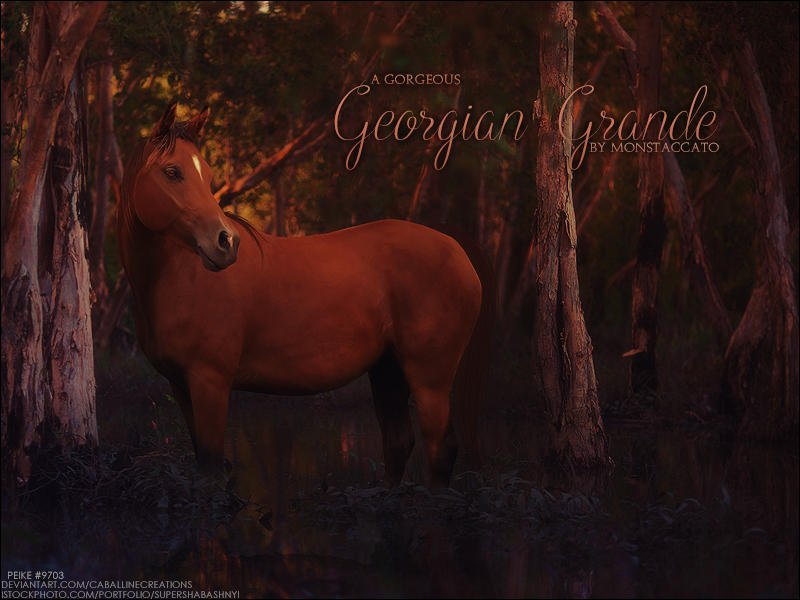
image for monnie
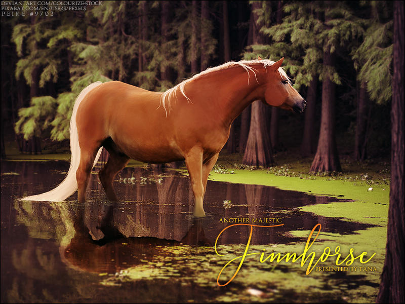
image for tana
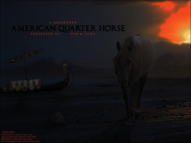
image for tana and siib |
View Comments 1


